Squarespace: Converting 4 Columns to 2 for Tablets with Marquee Template
The aim of this post is to show you how to make a row of 25% width columns into 2 rows of 50% width columns on iPads and similar sized tablets to make the text easier to read and remove the risk of long words breaking the page. Below are screenshots of the before and after, and if you don't care how it's done you can skip to the end where you can copy and paste the CSS into Squarespace.
before and after
The Why, Where & How
I use the the Squarespace Marquee template for my own website here at Digital Freelancer. It's a very clean (good white space) design with flexible SEO and parallax scrolling full-width images.
I first saw parallax scrolling images on the Dyson (vacuum cleaner) website. It's a subtle effect that makes the image scroll slower than the page so it looks like the page has been cut open to reveal the image beneath giving depth to the design.
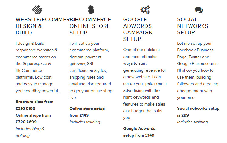
While it's a great template, when testing my site on an iPad I noticed that even when the tablet is held in portrait (that's a screen width of 768px), if you have a row of 4 columns at 25% width it doesn't condense down to 2 rows of 2 columns at 50% width. For me, this resulted in my list of digital marketing services looking like this:

As you can see from the screenshot above, WEBSITE/ECOMMERCE cannot break on to 2 lines, and even if I wanted it to, having about 4 words per line elongates the page and makes it harder for my visitors to read - which I don't want.
Custom CSS to Improve Responsiveness For Tablet Screensizes
So I decided to use some custom CSS for my Squarespace template to make the columns do what I wanted when viewed on smaller screens. To apply custom CSS to your Squarespace website, in the menu (assuming you're using Squarespace 7) go Home > Design > Custom CSS.
Note, I wasn't worried about mobiles because the Marquee theme already adapts well for screen sizes of 700px or less; reconfiguring a row of 4 columns to become 4 rows of 1 column at 100% width of the device.
I was looking to target devices with a screen size of between 701px and whatever screen size I felt the 4 columns looked ok. Due to some other responsive design changes I made, I decided this would be 910px. In the custom CSS text area I put the following CSS (if you have other custom CSS you must put this at the bottom). This is telling the browser that any CSS within the brackets will only be applied if the screen size is a minimum of 701px and a maximum of 910px.
@media only screen and (min-width: 701px) and (max-width: 910px) {
  /* CSS rules */
}
Targeting A Single Page With CSS in Squarespace
The other consideration to make was that I didn't want to affect my 4 column layout on the homepage. I feel that it's important to have these 4 columns visible in a row, although usability trumps all so for small devices like mobiles I'm happy to let the template optimise these 4 columns into 4 rows.

Because I don't want my custom CSS to affect the homepage, I must target the Services page specifically. To do this, I find the id that is unique to the Services page by looking at the page source code. The body tag will look something like this (the id is within the quote marks):
<body id="collection-547de0a3e4b0f3734370e66e" class="... there are a lot of classes so I won't list them all here">
Targeting Rows of 4 Columns Exclusively
Next I must target the blocks that make up a 4 column row. Squarespace applies a class called sqs-col-3 to all 4 column blocks. So I use this id and class in my custom css as follows:
@media only screen and (min-width: 701px) and (max-width: 910px) {
  #collection-547de0a3e4b0f3734370e66e .sqs-col-3 {
    /* CSS rules */
  }
}
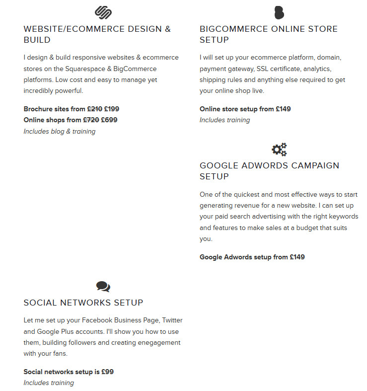
I've now targeted the elements of the page I want to change, so I just need to tell the browser what I want to do with these elements, which is to make them 50% of the screen width rather than 25%. I use the CSS width: 50% declartion but it has uncovered an issue with how the blocks of content break on to new rows as shown in the screenshot below:
The Final CSS
To combat this I need to turn off the float which is being applied to these blocks and display them as inline-blocks using custom CSS. Vertical-align: top simply ensures that any blocks of differing height will be aligned at the top rather than the default bottom. This is the final CSS
@media only screen and (min-width: 701px) and (max-width: 910px) {
  #collection-547de0a3e4b0f3734370e66e .sqs-col-3 {
    width: 50%;
    display: inline-block;
    float: none;
    vertical-align: top
  }
}
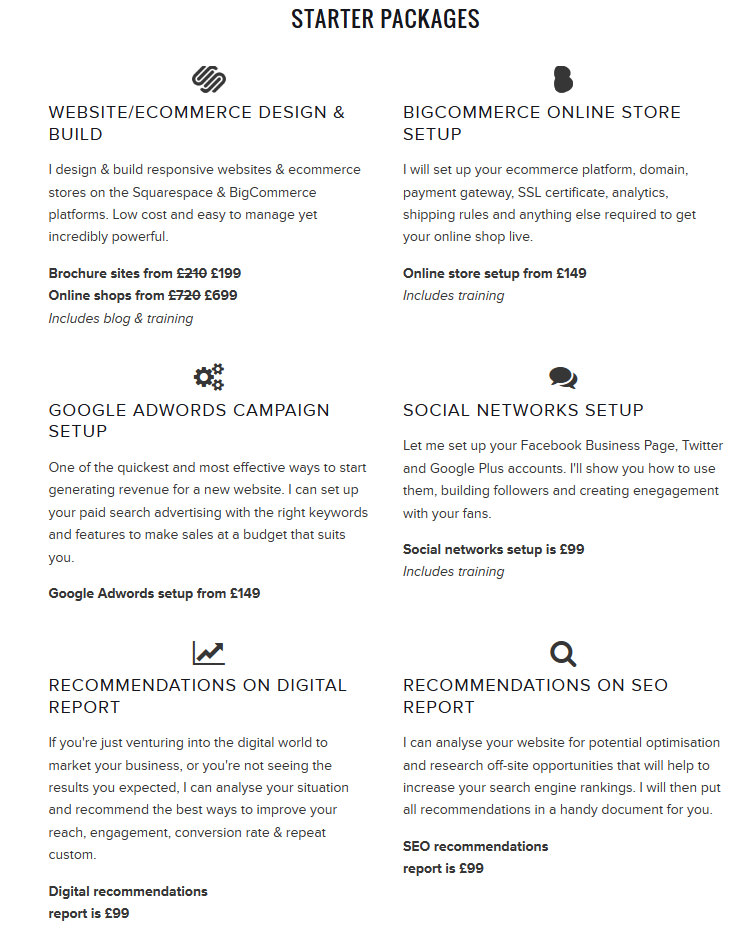
And the desired layout on iPads (and other devices between 701px and 910px):
